The “Science” Behind Beer Branding
[This post was sponsored by 99designs.com]
Whether you’re a brewer yourself or you just enjoy a cold one on the regular, you’ve probably enjoyed the fruits of the science behind beer branding many times. Beer brands receive a great deal of attention, because—particularly in this wonderful renaissance of craft beer and microbreweries—there are lots of brands out there, each one crying out for attention in a busy marketplace.
The Full Pint’s new look
Speaking of beautiful beer industry brands, you may have noticed The Full Pint has a sweet new look. Aside from the fact that their shiny new brand was created on 99designs by designer Ydesign27, it’s a great example of how the latest in branding and design wisdom combines with the specific needs of a beer (or beer publication!) brand.

The Full Pint was re-creating its look and feel after ten years and wanted something fresh and fun. The result is this flat, modern, energetic logo that is instantly recognizable as beer—and unique enough to represent beer that’s off the beaten track. Designer Ydesign27 is an experienced designer on 99designs who’s been creating art for clients on the platform since October of 2014. A designer like this with a flair for modern, innovative looks was a great choice for this project.
Now, how can you get a look like that for your own beer brand? Let’s take a look at the basic science behind branding beer.
Branding (and rebranding) for the craft beer industry
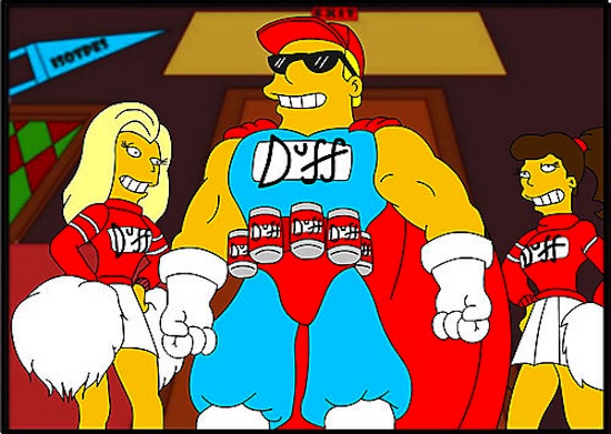
The craft beer industry produces some of the most interesting, beautiful labels and logos out there, bar none. There are several forces behind this result. For one, no one goes into creating a craft beer unless their heart is really in it, which generally means they throw themselves into every aspect of the beer’s look, too. Another reason is that craft beer aficionados know what motivates them to grab a new, mystery six pack off the shelf, and they translate those points of interest, humor, and appeal into their brand’s look. Finally, unlike Duff Beer of the Simpsons Universe, which will stand in for mass-produced, cheap beers in our universe, craft beer brands spend a little more time on achieving a unique look, and they might use more unique materials to achieve it.

Here are some tips to keep in mind when branding (or rebranding) within the craft beer industry:
Keep a narrow focus
Speaking of Duff, since your craft beer is basically the opposite of that kind of mass-marketed product, don’t be too broad in your focus as you brand. Choose a narrow target market and select your brand’s colors, style, and look from there. For example, if you’re hoping to market your new “Badass Brew” to younger millennials in their 20s, you’d better find out who and what younger millennials in their 20s think is badass.

Consider the details
As you brand your beer and make decisions about colors and things like illustrations versus simple graphics, don’t forget to account for all of the details before you make critical choices. Does your design need to work on both bottles and cans? This could change your range of options. If you’re bottling, what color will the bottles be? A design that looks perfect on a bright green bottle might not look as cool on a brown one.


Think through colors, shapes, and sizes
The hue of your beer in a clear bottle is your canvas; either carry it through onto your label or give it a striking contrast with its label. Green bottles look great with white or black labels, and bright, colorful accents. Brown bottles are neutral, and give you a lot to play with; if your beer is fairly traditional, stick to classic beer colors like amber, gold, brown, orange, or red. If your brand is modern or edgy, play that up with an alternative color scheme.

The paper you use for your label and its shape are another important consideration. A traditional shape and size is less costly, but also less notable. You can create a custom, die cut label, from standard paper or something more interesting like craft paper or a transparent plastic. Any of these choices will increase your costs for printing, but will also produce something very unique looking. Start with the size of bottle you’re using, your plans to either wrap it or use front and back labels, and your budget, and go from there.

Communicate your message with artwork and typography
Craft beers are responsible for elevating the humble beer bottle to the level of art. However, which kind of art you want really depends on your target audience. You might want an original cartoon, a more detailed illustration, photographs, graphics, or just a clean minimalist look. If you’re throwing some interesting flavors at younger consumers, it makes sense to encase that beer in something funny, a little crazy, or just really striking. If you’re selling something a little more upscale and aiming for a sophisticated market, lose the cartoonish stuff and stick to attractive, restrained designs and minimalism.

Similarly, your fonts communicate your brand’s personality and what it has to offer. For a more modern look, choose sans-serif fonts (the kinds without the little stems or feet). Classic looks generally benefit from serif fonts. And either way, avoid anything too weird to be readable. Beer labels include a lot of information by law, and it has to be legible—and anyway, of course you want everyone to instantly be able to read the name of the brand.

Get ready to get your label on (your beer)
Your very own star entry on the craft beer market deserves the perfect look and label that expresses the feel you want for your brand. In the end, the most important factor surrounding your label is that it stands for the brand. The right look will draw in the drinkers you are searching for, and give your beer the opportunity to turn them into loyal fans—and ultimately that look is part of their enjoyment of the beer.


